We started Endrant in 2008 when we took over WolfMP from another developer. Needless to say the train was very much already in motion and we had a short deadline and a small team to bring it home. All assets were produced by Raven for the Single Player version of the game and the initial layout and environmental design had taken place, so other than some sweeping level design changes to cut down the size of the maps our main ability to impact the visuals was limited to lighting and set dressing.
Our main tool for feedback was many, many rounds of screenshot paint-overs with focus on key gameplay areas to instruct the LD's on what to edit in the environments as they went about their various design tasks. For each level, I edited the sunlight parameters and skybox images myself then iterated with the LDs to find something that was both interesting to look at but did not detract from gameplay.
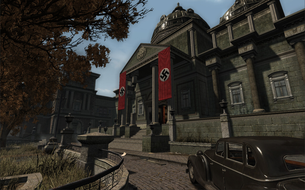
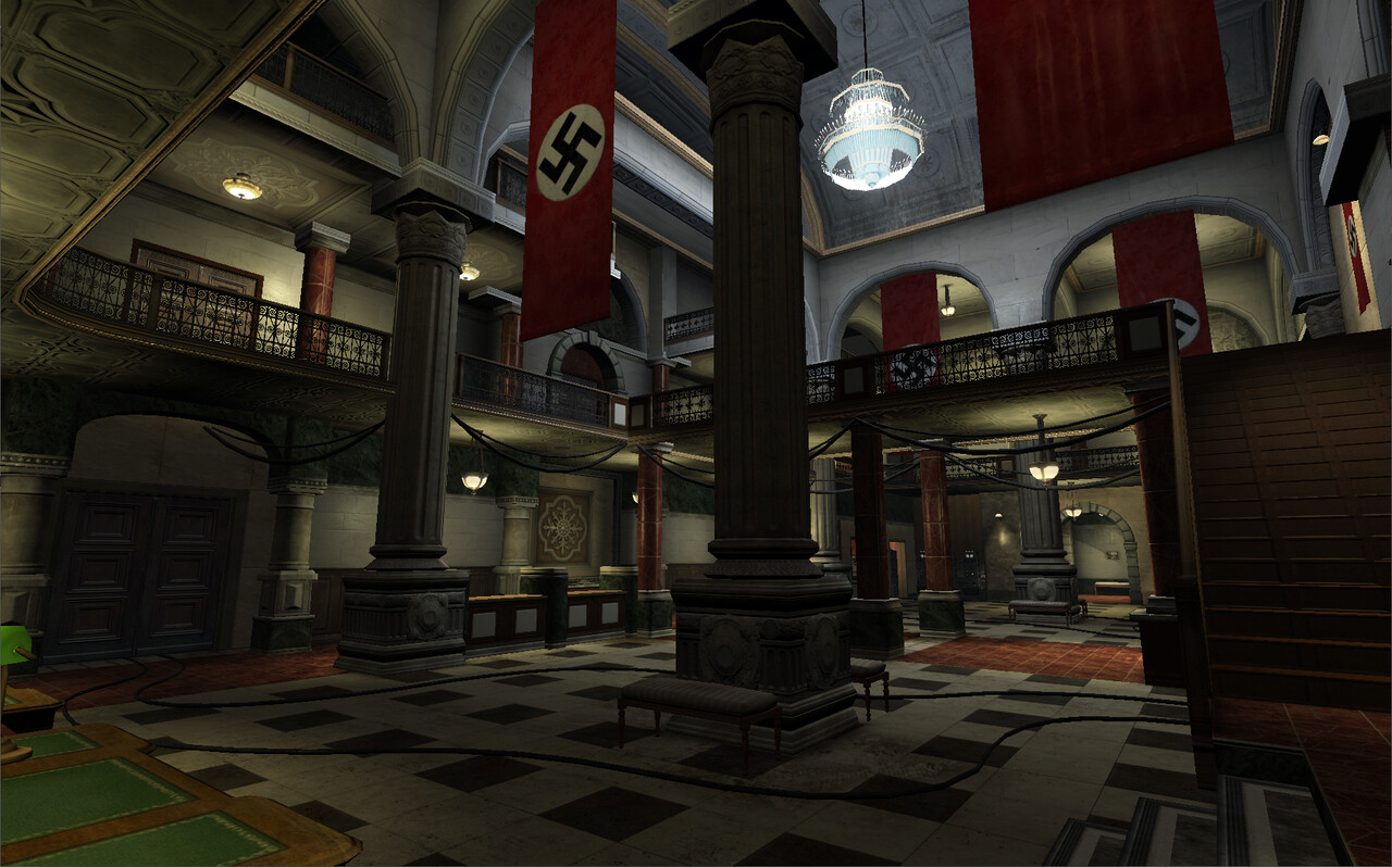
Bank
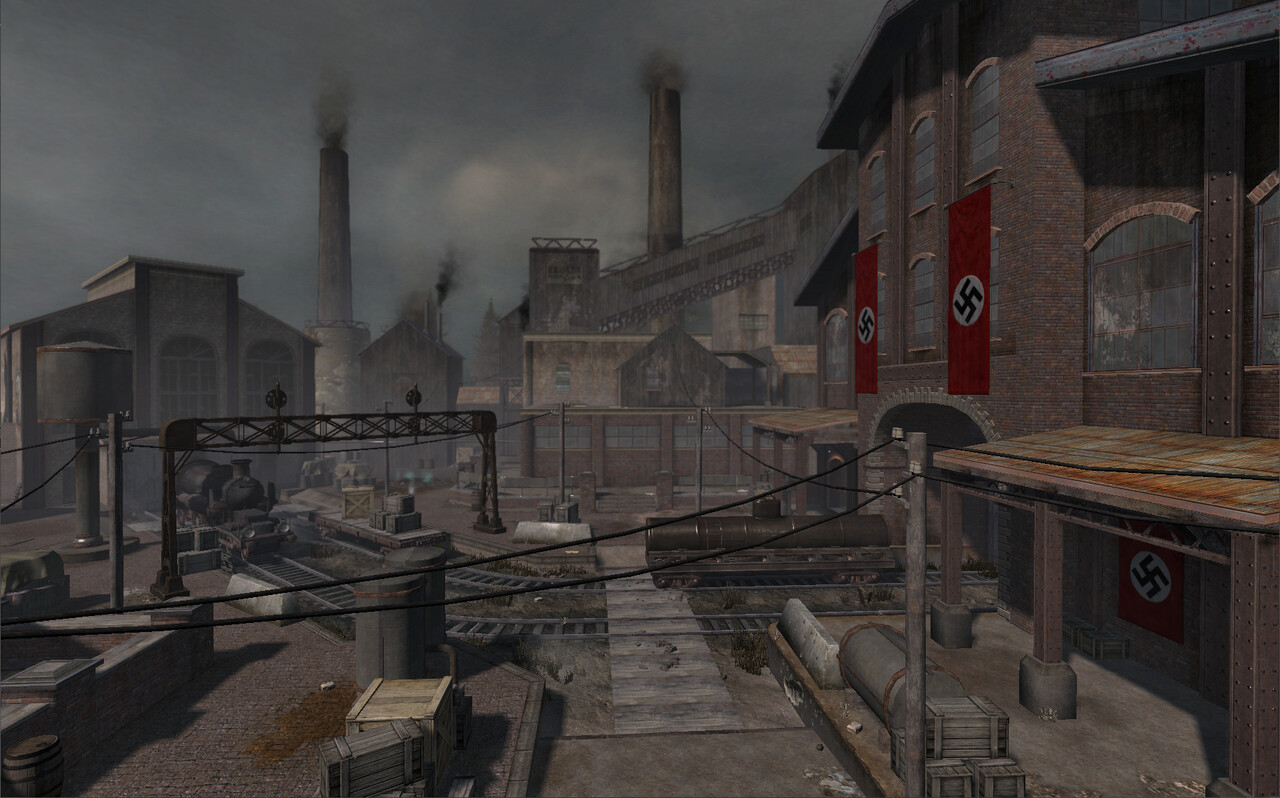
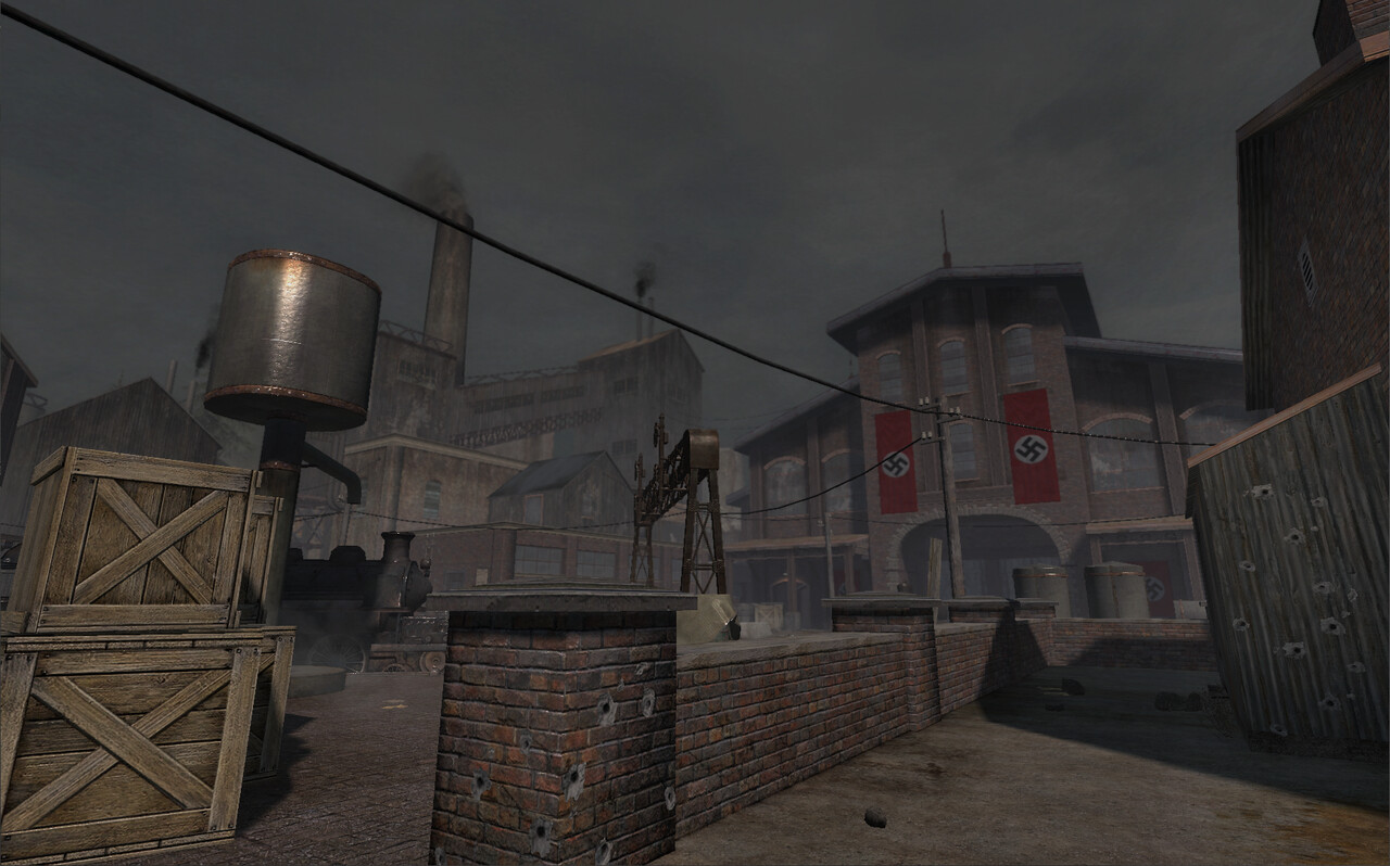
Getting a feeling of a clear sky while retaining the grey wartime aesthetic and keeping the shadows bright enough for gameplay was a challenge.
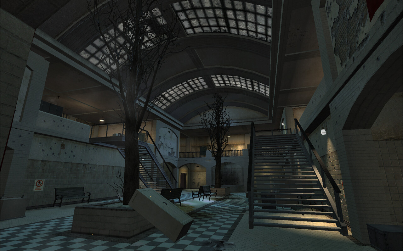
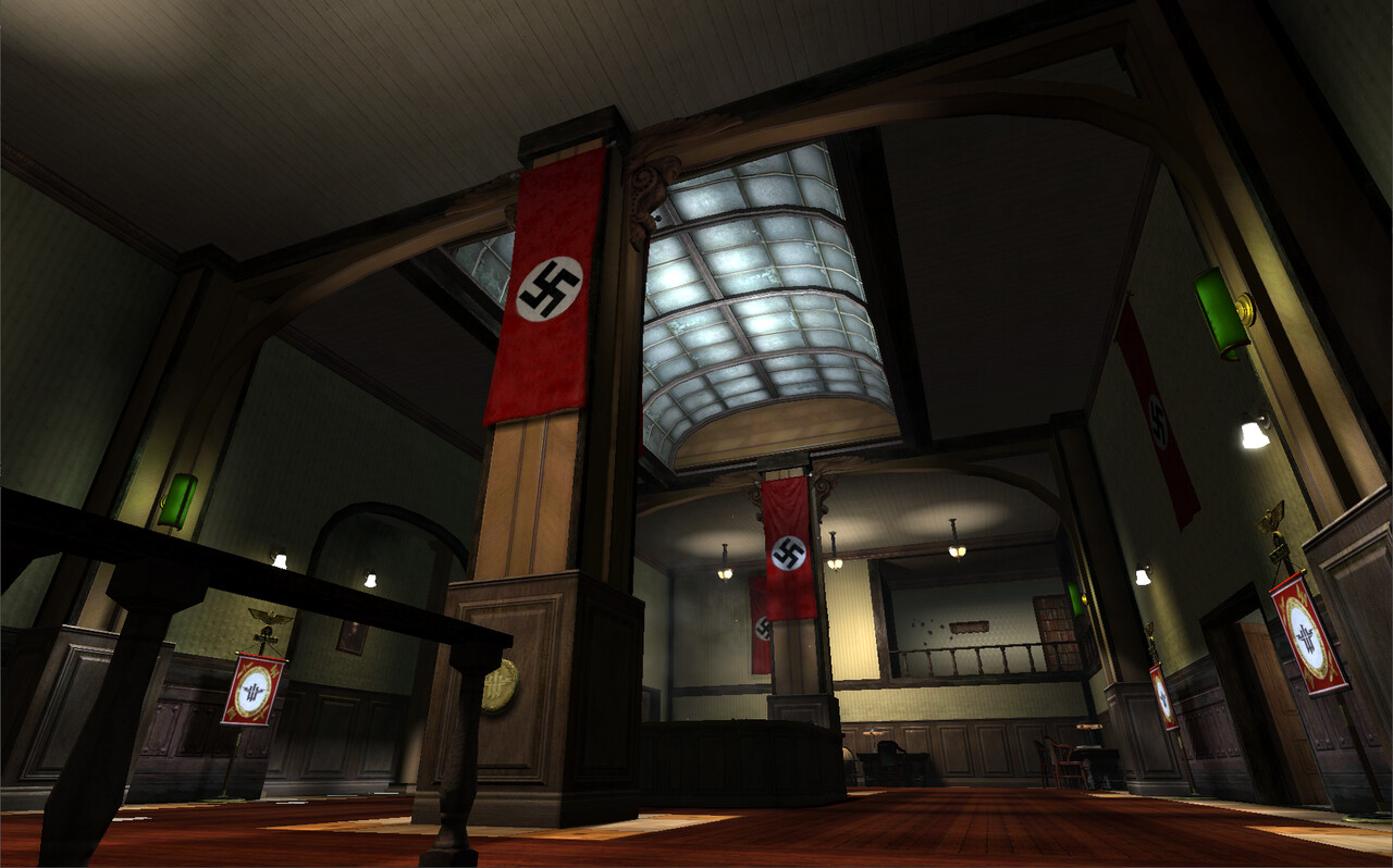
For interiors in general, the focus was on creating pools of light that would silhouette players as they moved through the space.
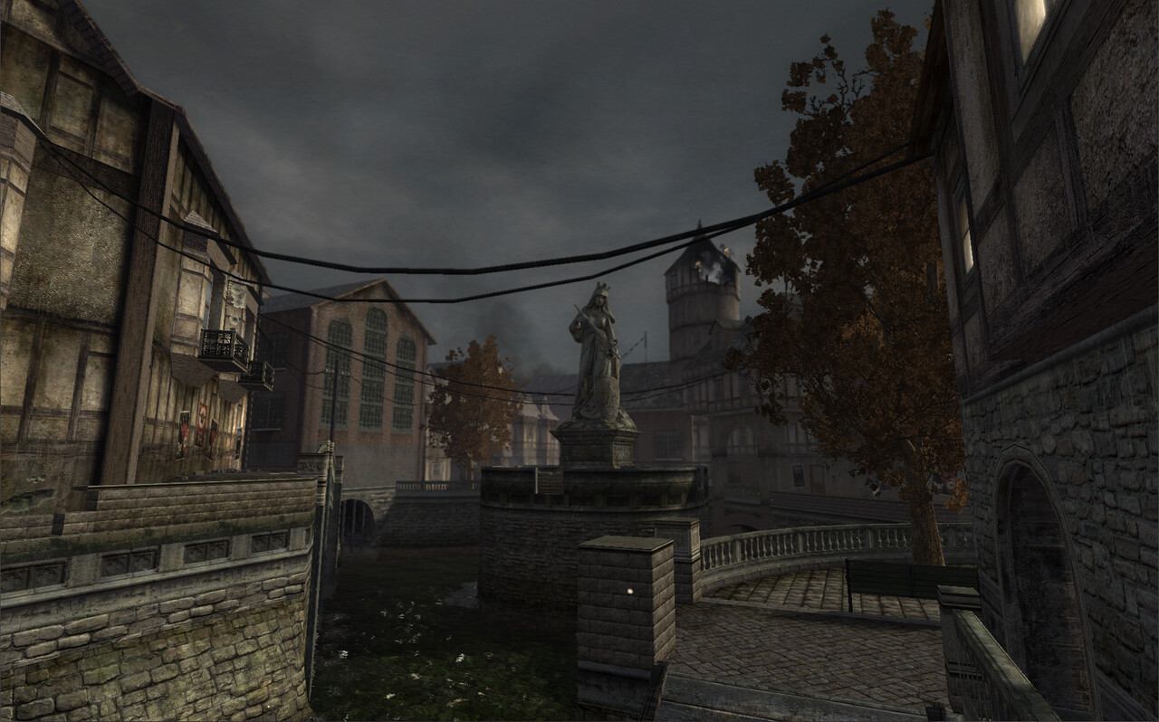
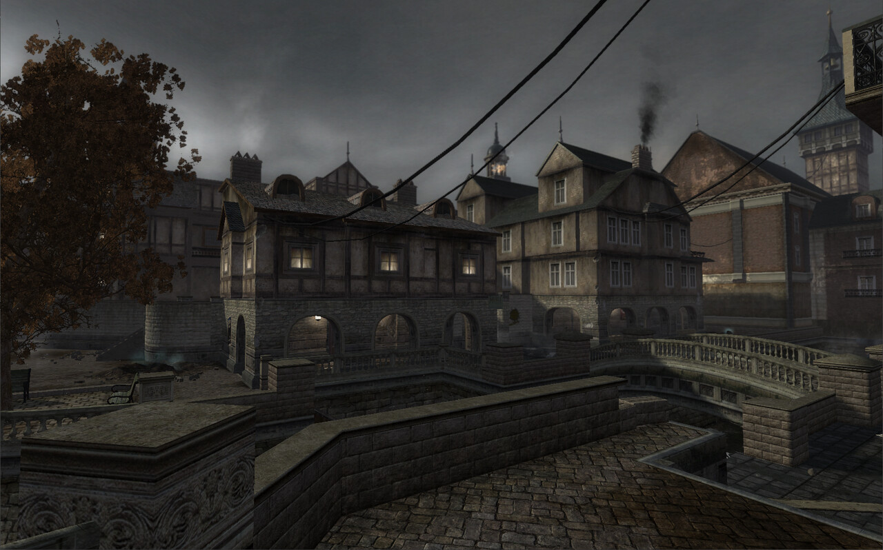
Canals
Alcoves and windows were lit to create some contrast and focal points in the shadowed areas of the maps.
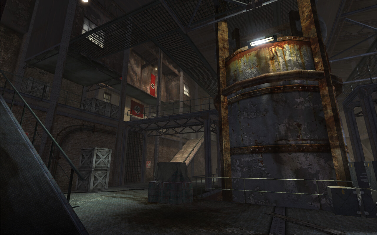
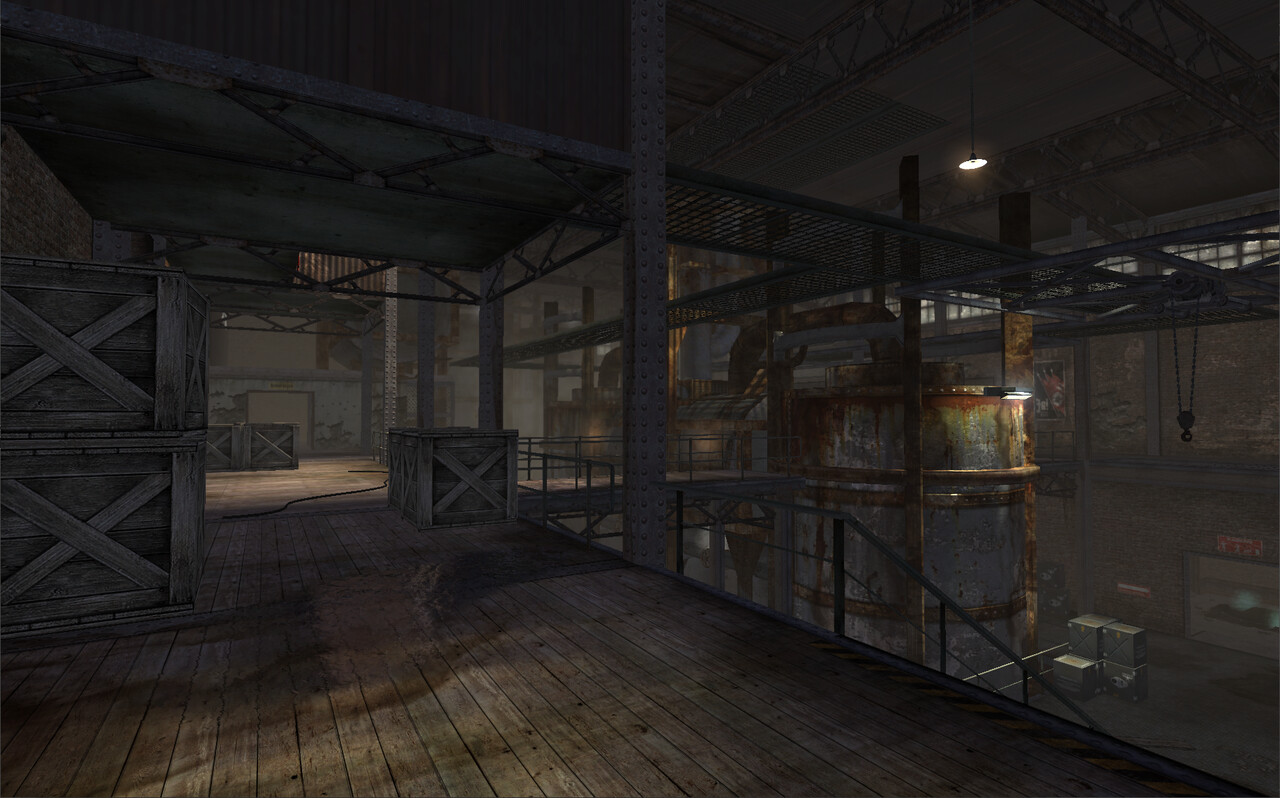
Chemical
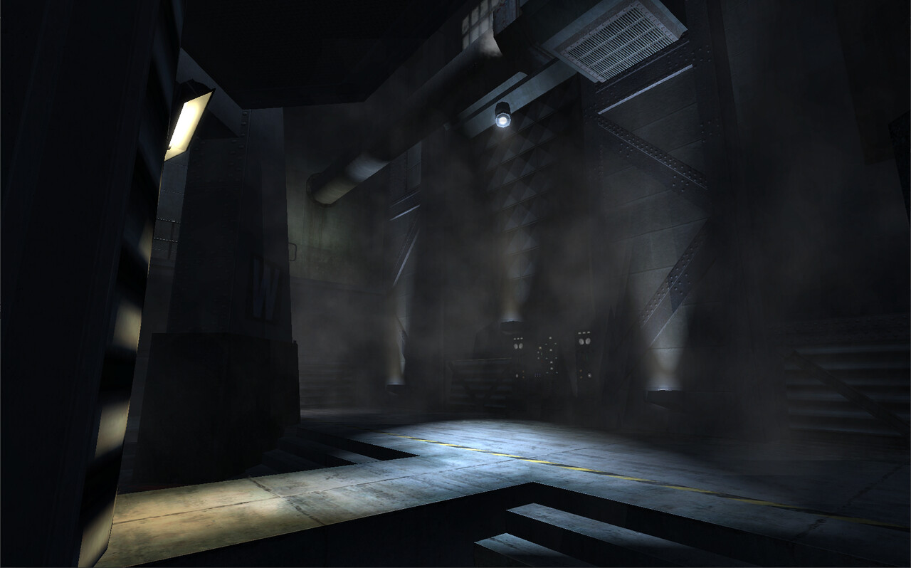
We used atmospherics for interior spaces as well to push the depth and emphasized the red in the rust of the metals.
Placing lights to create distinct areas of light and shadow rather than illuminating every playable area creates silhouettes for the players as they pass through gameplay spaces.
Facility
Each level had to be tuned carefully to push the atmospherics and tune skyboxes to create depth.
Specular and shadow were used to create focal points and increase contrast.
Hospital
We introduced faked "bounce" lights were possible to highlight areas of the map.
Manor
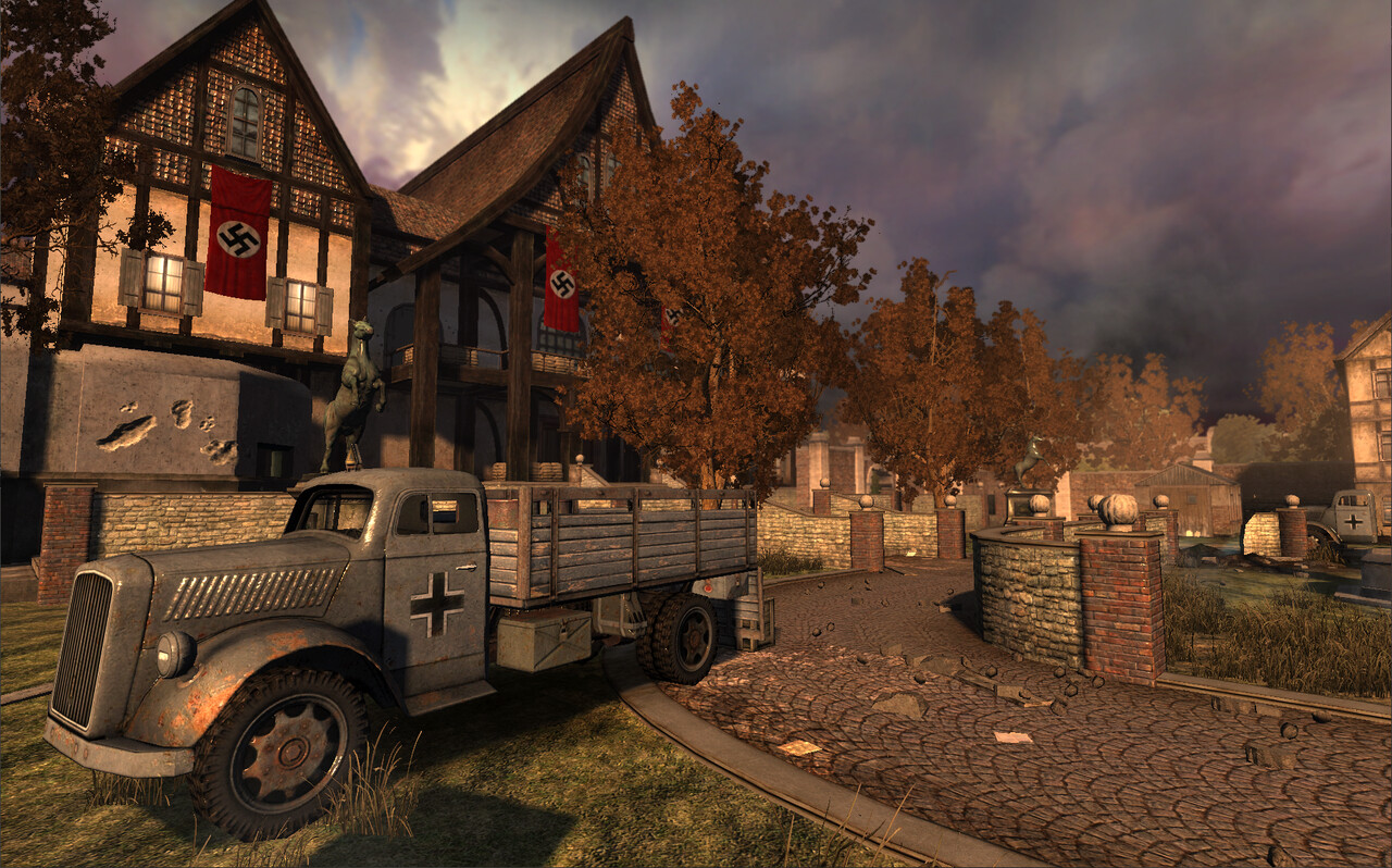
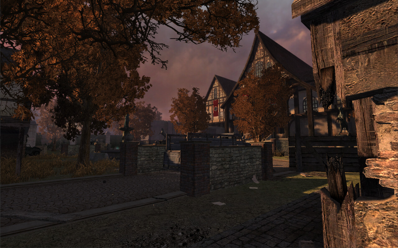
This was one of the few maps where we decided to go with more colour in the sky and lighting.
Deepening the shadows created a focus on the Manor and helped contrast the sky.
Rooftops
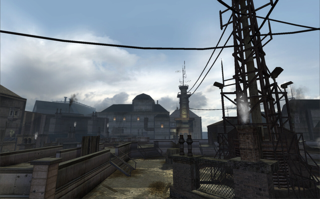
A rare "bright" sky for the game, adding in levels with contrasting themes helps contrast the mood across the levels.
Tesla
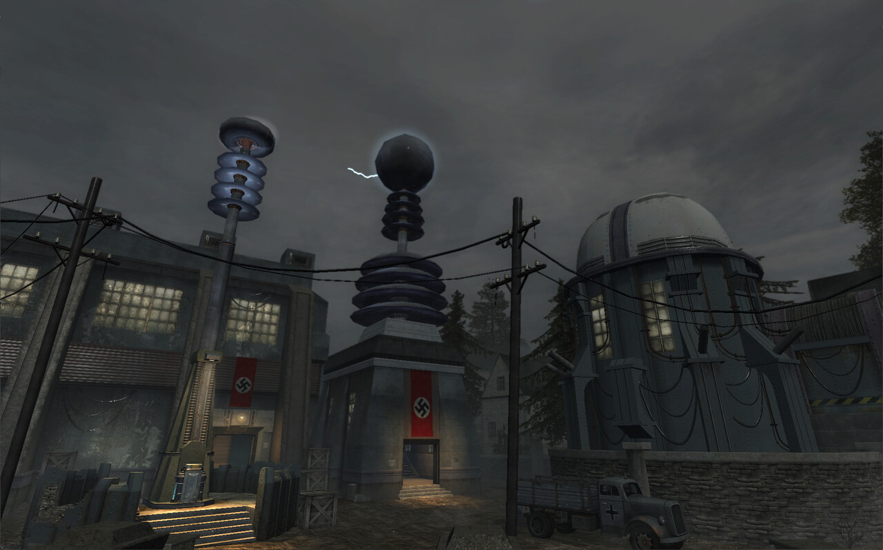
In this level (and in a few others) we used distance fires, lighting flashes and lit clouds to break up the skyline from the sky.
These interiors were a great opportunity to do more high contrast lighting. We spend a lot of time tuning these spaces for gameplay.
